Find My Food
UX/UI App Design (07.13.21 - 07.24.21)
An app design that allows users to find local restaurants that cater to their specific dietary needs.


Overview
Summary
Find My Food is an app design concept aimed to help users find restaurants that serve food according to the users’ dietary preferences and allergy restrictions. Need to find a restaurant that serves gluten-free and peanut-free dishes that are also keto-friendly? FMF has you covered!
Roles & Responsibilities
As the sole designer, my responsibilities included the following: user research (survey, user interviews and competitive analysis), creating personas, an empathy map, a journey map, user flow, wireframing, mockups, prototyping, user testing and reiteration.
The Problem
Easily finding restaurants and menu items that are in line with people's diet restrictions and food allergies.
The Audience
Find My Food is aimed at working adults, parents and college students that have busy lifestyles, yet are health-conscious and have a moderate level of tech savviness.
The Solution
Making a healthy restaurant finder app that takes users' diet preferences and allergies into consideration to find the best restaurants that are compliant with the users' needs. These findings will be based on 1) public information from restaurants and 2) user reviews and ratings.
Survey Key Findings
I took a survey to gather data about food and diet habits. This survey helped to reinforce the idea that adhering to a diet can be difficult, especially when dining out. However, that’s exactly the problem Find My Food aims to solve.
-

83% of participants lack time to eat healthy.
-

91% of participants have tried to diet.
-

50% eat out 2-3 days/week
Competitive Analysis
Through researching related apps, I was able to quickly pick up on what the apps did well and where there were areas for improvement. This analysis was critical to my ideas on information hierarchy, user flows, wireframes and mockups.
-

Find Me Gluten Free
“Find gluten-free friendly restaurants near you!”
• Specifically gluten-free, no other diet preferences options
• Design color and visuals don’t inspire thoughts of food
• Home UI feels busy
-

Spoonful
“Instantly find products that match your diet.”
• Only 1 dietary option can be selected at a time
• App has laggy behavior
• The UI is dull and unexciting
-

Yummly
“The recipe app that learns what you like.”
• The home screen UI feels busy and uncoordinated
• No spacing between content feels overwhelming
• Free trial to start but no freemium option thereafter
Personas
The survey and user interviews were key to revealing who the target audience would be for Find My Food, as well as who would be a low-priority/anti-user.
-
![]()
Katie
“The Young Professional “
Goals
With work and a busy social life, Katie needs to find restaurants that are compliant with her diet and that don’t exclude her from enjoying dinner with friends.
-
![]()
Julie
“The Working Mom”
Goals
As a mom with a child that has an autoimmune disease, Julie needs to figure out which restaurants can accommodate her whole family.
-
![]()
Pete
“The Semi-Retired Dad”
Goals
Per doctor’s orders, Pete needs to eat a lower-carb diet and eat less meat. Pete needs to find restaurants near him that serve healthy dishes without compromising taste.


User Stories
Through my research up to this point, I hypothesized what users would want to accomplish through the Find My Food app. I created stories for high-priority, medium-priority and low-priority users.
High Priority
“I want to easily find restaurants that serve dishes that are gluten-free and peanut-free so I can have a quick and safe meal after work.”
“I want to find restaurants that are compliant with my diet so when I go out to eat with friends, I can find something that will satisfy the entire group.”
Medium Priority
“I need to find restaurants that serve dishes for my child who’s on a special diet for nights I don’t have time to cook.”
“I need to find restaurants that serve dishes for my child who’s on a special diet so when the whole family goes out to eat, my child is not excluded.”
Low Priority
“I’m trying to eat according to my doctor’s orders and need to find restaurants that have tasty dishes so I can get an idea of what to cook at home.”
User Flow
Based on the competitive analysis and researching other apps, I created a simple user flow aligned with the minimum viable product.
I’ve created a simple user flow that demonstrates the onboarding process and where users can navigate from the home screen.

User Journey
I created a user journey that shows the process of a new user navigating the Find My Food app and what their experience might look like physically, mentally and emotionally.

Wireframing
Taking useful ideas from the competitive apps and remixing them gave me the start I needed to begin building the skeleton structure of the Find My Food app screens.

Diet selection screen

Home screen

Galaxy Cafe screen
User Testing and Feedback
Upon completing my wireframes and creating a low-fidelity mockup, I was able to test some of the app’s features such as bookmarking and making selections from the diet and allergy screens. I was also able to test the usability of the app and gain a better understanding of the user experience.
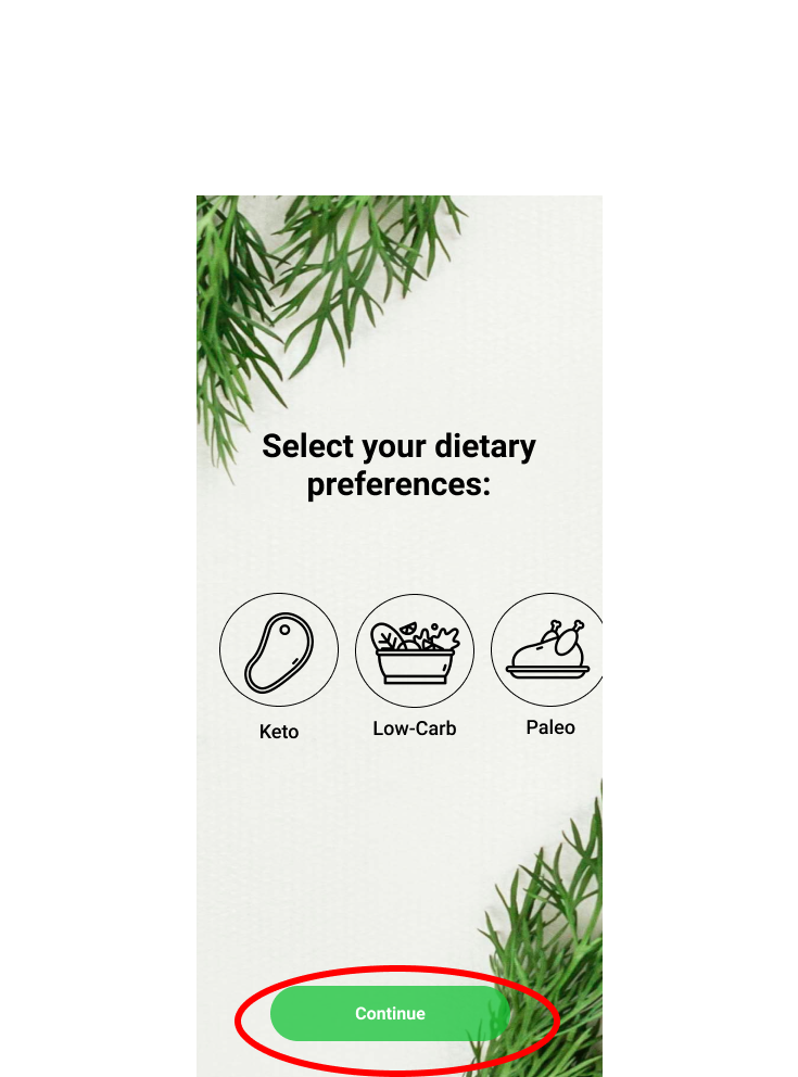
Button size on the preferences screen was inconsistent with the sign-up screen.

Lime green color was not preferred by testers, premium section needs better differentiating and the stars were recommended to be solid.

Screen titles should be consistent across all screens.
Branding
Overall, the branding for Find My Food is simple, yet elegant. The use of green felt like a no-brainer as green can symbolize freshness, health and energy and the typography uses mostly Roboto, a classic choice.
-

Name
An easy and straightforward name that aligns with the goal of the product. Adding ‘My’ into the name makes the app feel like it’s fully catering to the user and their preferences.
-

Color Palette
Green is the main color, as it embodies health and freshness, along with black and white for legibility. Tested on Adobe Color for accessbility.
-

Typography
Roboto is the type used for all text outside of the screen titles. A go-to type for demonstrating order an elegance.
Josefine Sans is used for the brand name and title screens. This warm and friendly font has personality without going overboard.
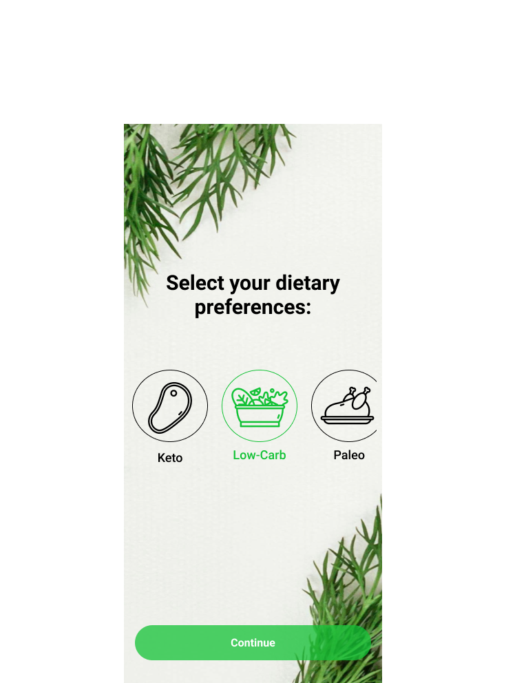
High Fidelity Prototype
At last! From research all the way to testing, I was able to reiterate my design based off of feedback to bring you the Find My Food app design in all its glory.

Hi-fi diet selection screen

Hi-fi home Screen

Hi-fi Galaxy Cafe screen
Final Thoughts
Find My Food started out as an idea for one thing and ended up evolving into something more meaningful, based off of survey data and user interviewing. The idea for FMF to be a restaurant search engine that’s tailored by user preferences was completely collaborative and has helped me to realize that by talking to people and finding out their wants and needs is pivotal for good ideas and then bringing those ideas to life.
I used my knowledge of UX/UI design to do competitive research, make a survey, create meaningful personas, design user flows, a user journey, wireframes and a testable prototype.
So much was learned through user testing. I’ve learned that it helps tremendously to get fresh eyes on a project I’m working closely on as this helps to gain more perspective and to truly create user-centered design. The feedback I received helped me to create a UI that is consistent, visually appealing and accessible to all.
User testing demonstrated an 87.5% success rate in navigating through the app and completing the required tests. Feedback mostly came down to the visual design, of which I went back and made necessary changes (making buttons and titles consistent across the board, a more accessible color palette, and a few other minor details).
One of the biggest takeaways I took from this project is the attention to detail. It’s easy to focus on the macro-level of a project, creating a design on the level of M.V.P. But what separates good design from amateur work is the details. Moving forward, I’ll be paying special attention to the little details, putting integrity behind every project I’m working on.
To make Find My Food even better, I believe that more user testing should be done with the new prototype as well as further research. What separates FMF and apps like it is a greater ability to tailor one’s dining experience and a UI that is warm, inviting and easy to use.